Engagements: Appointments, Email, SMS, and Tasks
LeadCenter provides different marketing reports for you to monitor and track daily activities, analyze the outcome of marketing efforts, and make informed decisions. This comprehensive tool helps you visualize various metrics in a more digestible format. The Engagements dashboard presents you with the following engagement metrics:
- Appointments
- Emails
- Calls
- SMS
- Tasks
Accessing engagement reports
To access engagement reports, follow these steps:
- Sign in to your LeadCenter.AI account.
- Click on Reports in the navigation sidebar on the left.
- In the Marketing Reports section, click on Engagements (Appts, Email, SMS, and Tasks).
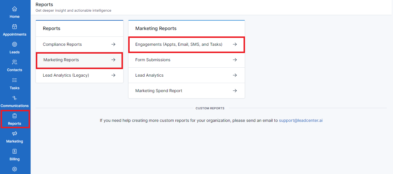
- You’ve reached the Engagements Reports dashboard.
- Switch among these tabs on the screen to view the required report:
- Appointments
- Emails
- Calls
- SMS
- Tasks

Note
In addition to accessing the engagements reports, you can select a date range to view lead activity.
Select date range
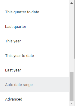
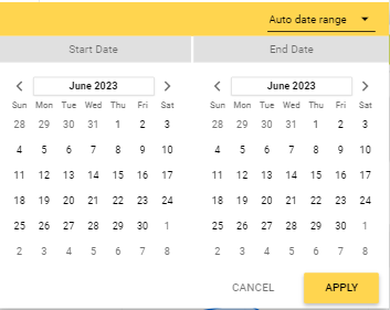 Select from a number of options and view yearly, quarterly, monthly,
weekly, and daily analytics.
Appointments tab
Upon accessing the engagements reports, the default view is for the appointments. Here you can view all meetings you scheduled with clients over the selected date range.
Filters
The filters here are
- Advisor: Click this drop-down to select the advisor(s) who interacted with the leads via scheduled appointments.
- Meeting Category: Use this drop-down to select the category of the meeting. For example, a consultation or a general information call.
- Lead Source: Click on this drop-down to select the source where leads are coming from. This will enable you to view sources that bring potential leads.
- Lead Stage: Click on this drop-down to view the stage your lead is in. For example, if your lead is in the consideration stage, you should target them with relevant information about the subject matter.

Performance metrics
You can see the performance metrics below the filters. These metrics are:
- Meetings: It shows the total number of meetings
- Confirmed: It shows the number of confirmed meetings.
- Completed: It shows the number of confirmed meetings that took place and moved on to the completed stage.
- Canceled: It shows the number of meetings that got canceled.

Graphical representation of appointments
You’ll see two graphs representing the appointments:
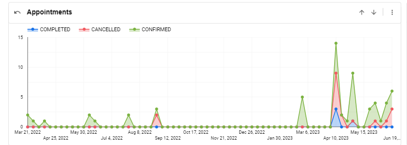
Appointments
This graph shows the meetings in accordance with the dates these were created.
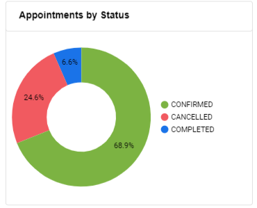
Appointments by Status
This pie chart shows the percentage of appointment status. For example, 10% of the scheduled appointments were confirmed, 20% were canceled, and 5% got completed.
Tabular representation of appointments
By the end of this page, you’ll see a tabular display of all appointments. The table, List of Appointments, houses all appointments and has various columns to contain relevant information regarding an appointment. These columns are:
- Id: The unique number assigned to a meeting.
- Advisor: The name of the financial advisor leading this meeting.
- Client Name: The name of the client/potential lead.
- Date Created: The meeting was created on this date.
- Meeting Date: The meeting will take place on this date.
- Meeting Category: The purpose of the meeting. For example, a consultation.
- Meeting Status: The status of the meeting. For example, the meeting has been completed or canceled.
- Lead Stage: The level of buyer’s journey your lead is at. For example, the proposal stage.
- Source Calendar: The calendar used to schedule the meeting. For example, Outlook, Redtail, etc.
- Lead State: The open state is when lead nurturing is underway. The closed state means that the lead moved forward to the next step.
- Won or Lost: The lead is won when they move forward with your offer otherwise, it’s lost.

Other functions
The List of Appointments table offers some other functions as well. Click on the three-dot menu on the right side of the table to reveal these options:
- Sort by: Select this option to sort the table by any of the given columns.
- Reset: Select this option to return to the default view of the table.
- Export: Click on Export to see a modal with different options. Select one of the given file formats to start exporting the data represented in the table.
Emails tab
Switch to the emails tab and view valuable information about your email engagement efforts and make data-driven decisions for precise targeting. Here you can see how the emails are performing, and identify the ones that are resonating more with your target audience.
Performance metrics
You’ll see different performance metrics at the top of this page. These metrics are:
- Emails: It shows the total number of emails.
- Sent: It shows the number of emails that you sent.
- Received: It shows the number of emails that you received.
- Viewed: It shows how many people viewed the email you sent.
- Link Clicked: It shows the number of clicks that your email received.

Graphical representation of emails
You’ll see two graphs representing the emails:
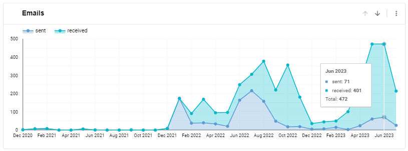
Emails
This graph displays the emails sent during the required date range.
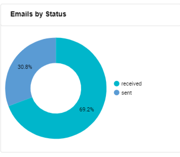
Emails by Status
This pie chart shows the percentage of emails with different statuses. For example, 60% sent, and 40% received.
Tabular representation of links clicked
You can see a table with a list of links and a column next to it for the number of times the link was clicked.

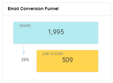
Email Conversion Funnel
For a simpler view of how email marketing takes place, scroll down to the end of this page and see the email conversion funnel. It enables you to take a quick glance at how the emails work and generate views and clicks.
Calls tab
Switch to the calls tab and view the statistics of your inbound calls. The metrics here enable you to better understand customer interactions and improve engagement.
Performance metrics
You can view the following performance metrics here:
- Calls: The total number of inbound calls.
- Answered: The number of answered calls.
- Busy: The number of calls declined due to busy lines.
- No Answer: The number of calls that received no answer.

Graphical representation of the inbound calls
You’ll see two graphs representing the inbound calls statistics:
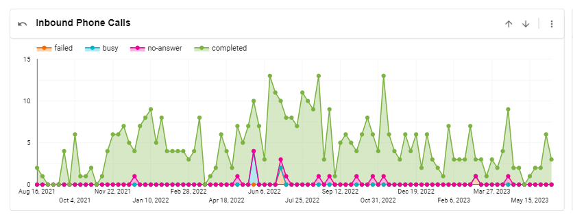
Inbound Phone Calls
This graph displays the total inbound calls received during the required date range.
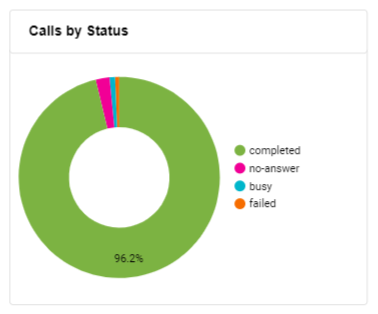
Calls by Status
The pie chart displays the percentage of completed and no-answer calls. It helps you better allocate resources to the calls not getting answered.
SMS tab
You can go to the SMS tab and view the message-related statistics. This enables you to measure the performance of SMS as a potential marketing channel.
Performance metrics
You can view the following performance metrics here:
- SMS: The total number of SMS.
- Sent: The number of sent messages.
- Received: The number of messages received.
- Delivered: The number of delivered messages.

Graphical representation of the sent and received SMS
You’ll see two graphs representing the incoming and outgoing messages:
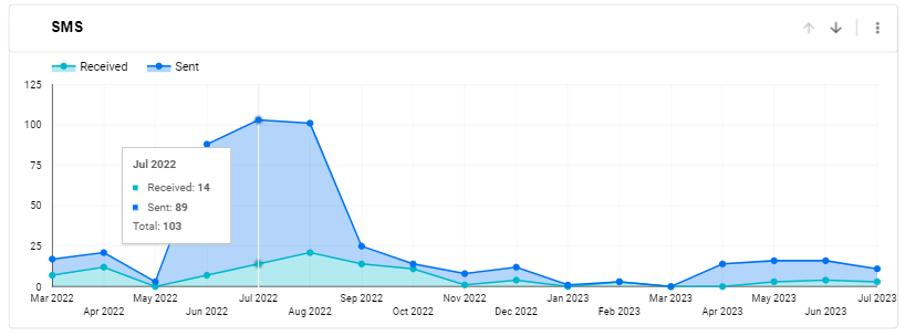
SMS
This graph displays the total number of messages sent and received during the required date range.
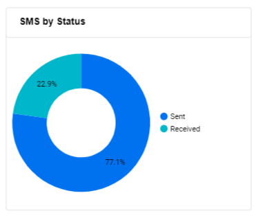
SMS by Status
The pie chart displays the percentage of sent and received messages.
Tasks tab
You can go to the tasks tab and view metrics for tasks. It corresponds with the daily task management of your account and keeps track of all tasks-related activities.
Performance metrics
You can view the following performance metrics here:
- Tasks: The total number of tasks.
- Completed: The number of completed tasks.
- In Progress: The number of ongoing tasks.
- Not Started: The number of tasks that are yet to start.
- Canceled: The number of tasks canceled by the assignor or the assignee.

Graphical representation of Tasks
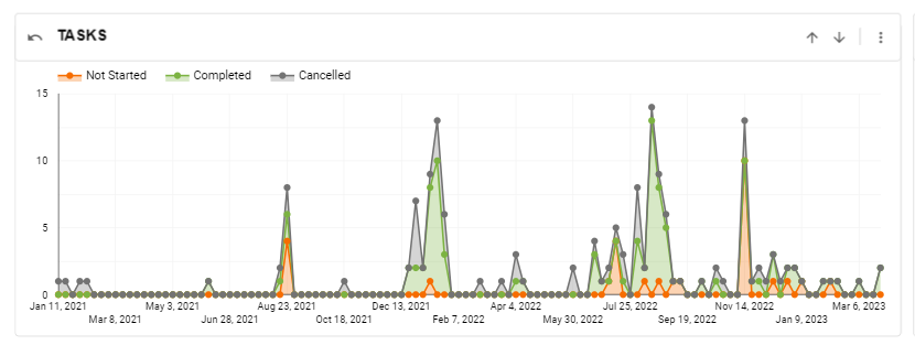
You’ll see two graphs representing the completed, canceled, and not started tasks:
Tasks
This graph displays the total number of tasks during the required date range.
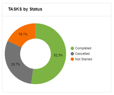
Tasks by Status
The pie chart displays the percentage of completed, canceled, and not started tasks.
Line graph functions
All of the Engagements reports are represented by individual line graphs. On the right side of each of these graphs, you'll see two arrows and a three-dot menu.
Drill up
Use the upward arrow to have a bird's eye view of each report.
Drill down
Use the down arrow to have a more detailed view of the required report.
Three-dot menu
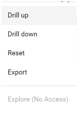
Alternatively, you can click on the three-dot menu to Drill up, Drill down, Reset, and Export lead generation data.
Additional functions
In addition to the filters, you can see two buttons on the top right side of each report:

Reset Filters
Download (PDF)
You can use this button to download the required analytics report as a PDF. Follow the steps below:
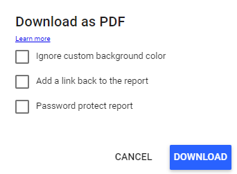 Click Download to proceed or
Cancel to go back.
