Lead Analytics
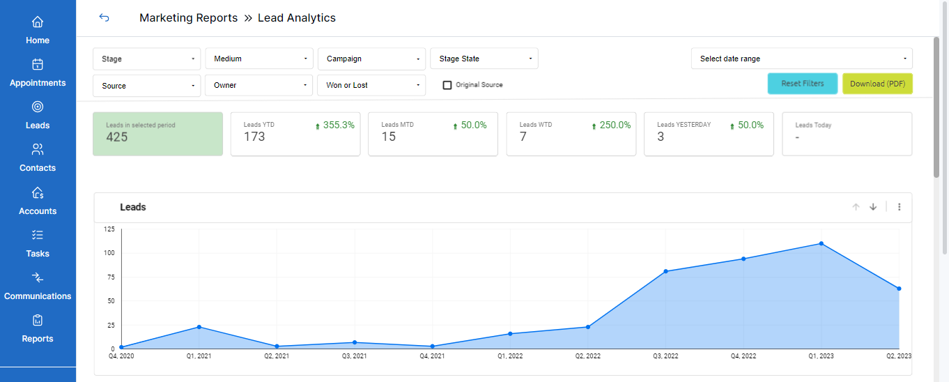
Lead Analytics refers to tracking and analysis of lead-related information. In simple terms, lead generation analytics helps track lead-related activities and enables you to make informed decisions. LeadCenter offers a holistic dashboard to view and monitor different reports regarding lead activity. Here’s what you can view at a glance:
- Number of leads generated
- A graphical view of the leads generated
- A view of leads grouped by source/stage/medium represented by pie-charts
- Detailed information of leads grouped by Source/Stage
Accessing lead analytics
To access the lead analytics dashboard, follow these steps:
- Sign in to your LeadCenter.AI account.
- Click on Reports in the navigation sidebar on the left.
- In the Marketing Reports section, click on Lead Analytics.
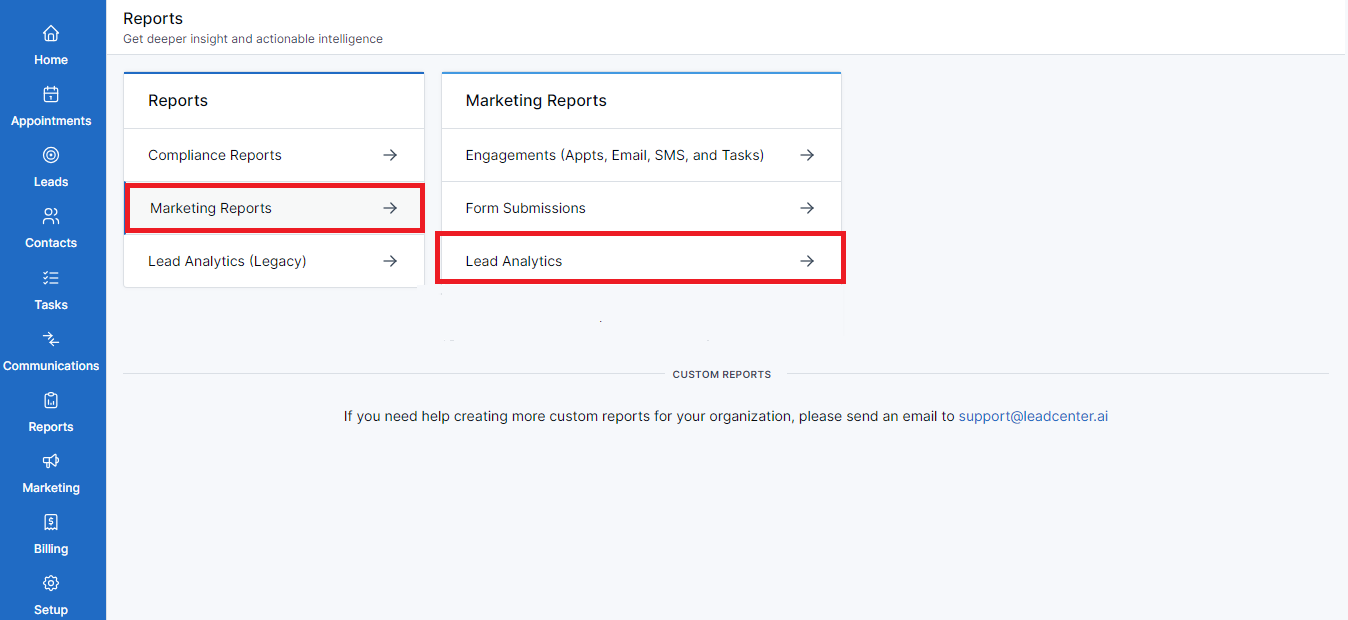
- That’s all. You’ve reached the Lead Analytics dashboard.
Filters
You’ll see different filters on top with drop-down menus to choose from. You can select as many filters as required.

The filters that you can use to narrow down required lead information are:
Stage
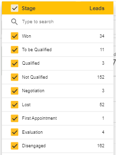
Click on the drop-down menu to see all the stages of a lead’s journey. For example, Won, Lost, Qualified, Negotiation, etc. You’ll also see the number of leads in each stage.
Medium
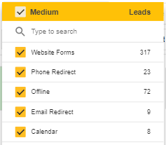
Click on the drop-down menu to select the mediums your leads are using to reach you. For example, Zapier, Redtail, Website Forms, etc.
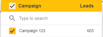
Campaign
Click on the drop-down menu to view the leads generated as a result of a campaign.
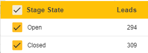
Stage State
Click on the drop-down menu to select one or both stages of a lead’s journey. Selecting Open will show leads that are currently processing while selecting Closed will reveal leads that have been converted or lost.
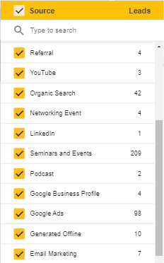
Source
Click on the drop-down menu to see where the leads are coming from. For example, Youtube, Facebook, Email marketing, etc.
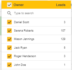
Owner
Click on the drop-down menu to select and see the lead’s owner. For example, if you select your name, you’ll see the leads that you brought.
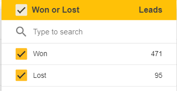
Won or Lost
Click on the drop-down to see won or lost leads.
Additional functions
In addition to the filters, you can see three more buttons on the top right side of this dashboard:
- Select date range
- Reset Filters
- Download (PDF)
Select date range
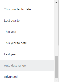
- Use this drop-down to select a specific date range and view the analytics accordingly.
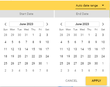
- Select from a list of options and view yearly, quarterly, monthly, weekly, and daily analytics.
Reset Filters
- Use this button to clear all the selected filters and reset it to the default view.
- You can reapply all of these filters as required.
Download (PDF)
You can use this button to download the analytics report as a PDF. Follow the steps below:
- Click on the Download (PDF) button.
- A modal will open prompting you to download.
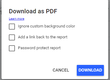
- Click Download to proceed or Cancel to go back.
Lead generation performance metrics
There are different marketing performance metrics regarding lead generation data. It displays the number of leads generated:
- Within a required date range
- Within a year
- Within a month
- Within a week
- Yesterday, and
- Today

Graphical representation of leads
You can visualize the generated leads in graph form. On the right side of this graph, there are two arrows and a three-dot menu.

Drill up
Use the upward arrow to have a bird's eye view of leads generated.
Drill down
Use the down arrow to have a more detailed view of leads generated.
Three-dot menu
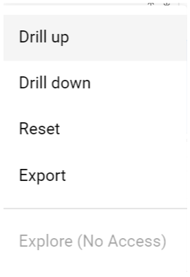
Alternatively, you can click on the three-dot menu to Drill up, Drill down, Reset, and Export lead generation data.
Exporting lead data
To export this data, follow these steps:
- Click on the three-dot menu.
- Select Export.
- A modal will open.
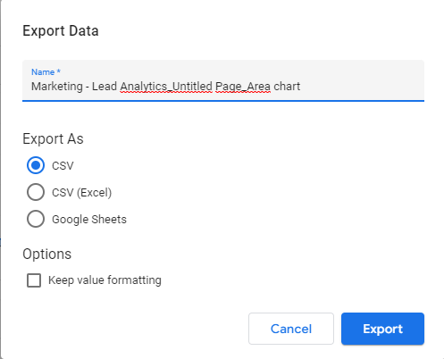
- Select the file format to export the data in.
- Hit the Export button to proceed or Cancel to go back.
Pie-chart representation of lead data
Scrolling down this dashboard, you’ll see pie charts representing the leads generated by:
- Source
- Stage
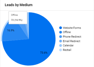
- Medium
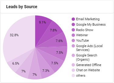
Leads by Source
Here you’ll see all the sources the leads are coming from. The source with the highest percentage enables you to target your marketing efforts accordingly.
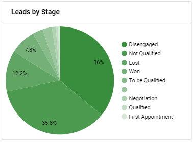
Leads by Stage
This pie chart displays the different stages that a lead goes through. You can view the current stage of leads and take proactive measures. For example, focusing on nurturing qualified leads or moving forward with the won leads.
Leads by Medium
This chart shows you the path your leads are taking to get to you. It enables you to target the mediums with the highest percentage. For example, if most of the incoming leads are using Chat as a medium to communicate, you should be investing in customer support and automation.
Tabular view of Leads by Source \ Current Stage
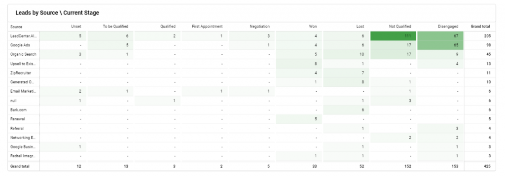
Scroll down to the end of the page and you’ll find a tabular representation of leads categorized by source and current stage. Here’s how this works:
- The first column represents a source from where leads are generated. For example, email marketing, social media ads, referrals, etc.
- Each column after the source column represents a different stage this lead is in.
For example, 10 out of 50 incoming leads from email marketing are in the Qualified stage, 2 are in the Spam stage, 10 are in the Lost stage, and 3 are already existing customers.
The value proposition
This tabular display of all your leads in different stages along with the source they’re coming from enables you to take account of your marketing tactics. You can tailor your marketing strategies to the source that is generating the highest lead-to-conversion rate.
